01
Conversion & Digital Experience
Digital Design · Customer Experience
A data-informed redesign that increased conversions by 23%.
The Problem
Customers were not adopting the online payment registration system at the desired rate. Existing communications lacked clear hierarchy and did not effectively guide customers toward completing registration.
My Role
I led the end-to-end design execution for this initiative, partnering with marketing and cross-functional teams to improve the performance of the customer payment registration flow. My role focused on optimizing layout, hierarchy and usability while ensuring all assets were production-ready and aligned with brand and compliance standards.
Approach & Execution
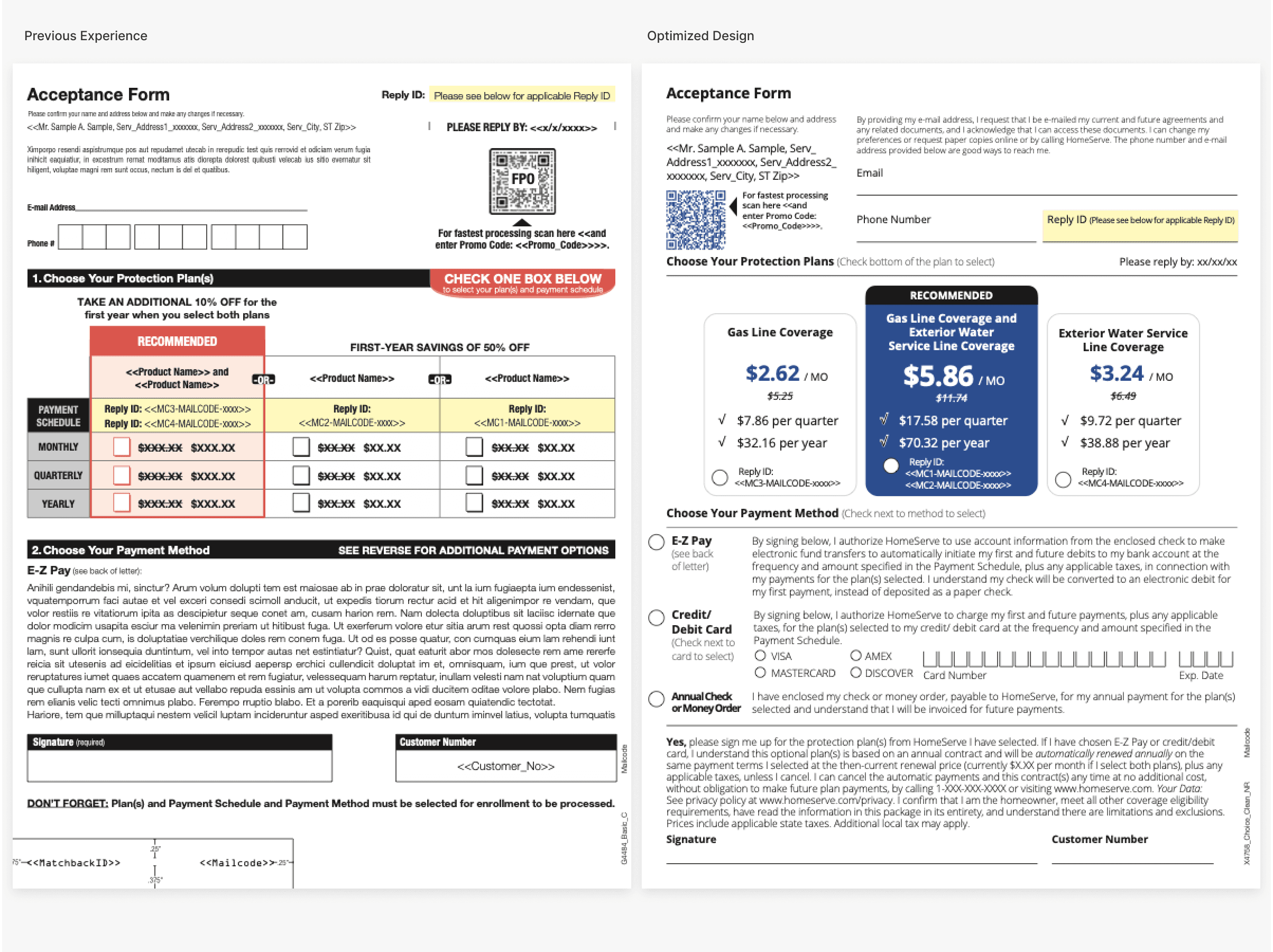
The goal of this project was to improve completion rates within the customer payment registration flow. The existing experience was underperforming, with users dropping off at key steps due to unclear hierarchy and dense content.
Audit & Insights
I conducted a review of the existing experience to identify friction points and areas for improvement.
- Key actions were not visually prioritized, making it difficult for users to identify the next step
- Content was dense and lacked clear structure, reducing readability
- Inconsistent spacing and typography impacted overall clarity
- Users lacked clear visual guidance throughout the flow
Design Strategy
Based on these insights, I focused on simplifying the experience and guiding users more clearly through each step.
- Simplify content to reduce cognitive load
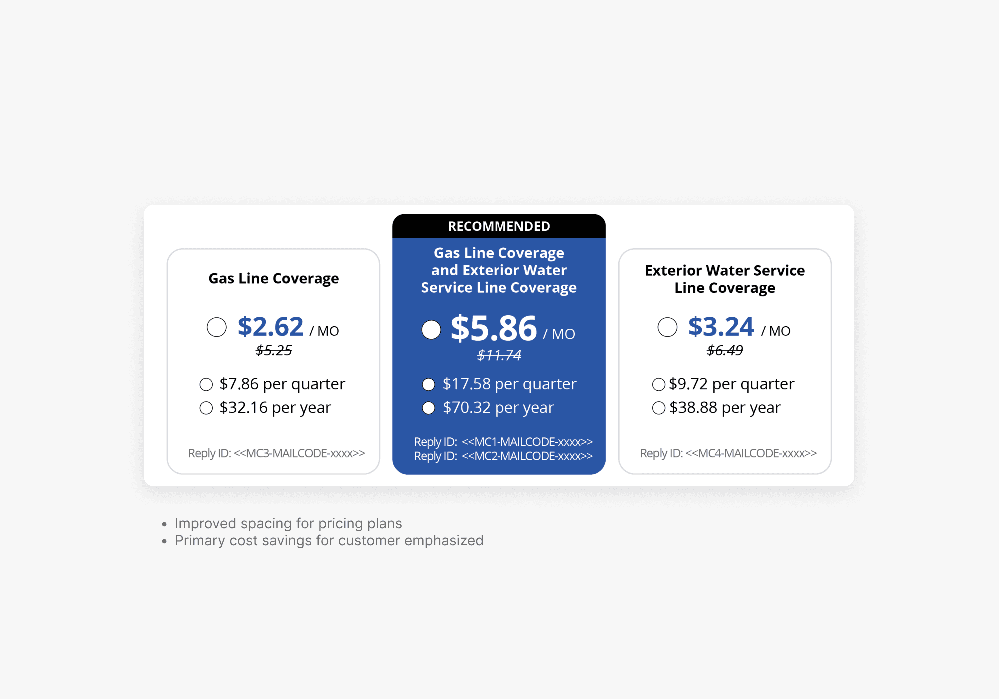
- Strengthen visual hierarchy to emphasize primary actions
- Improve scan ability through structured spacing and typography
- Maintain consistency across templates and touch-points
Execution
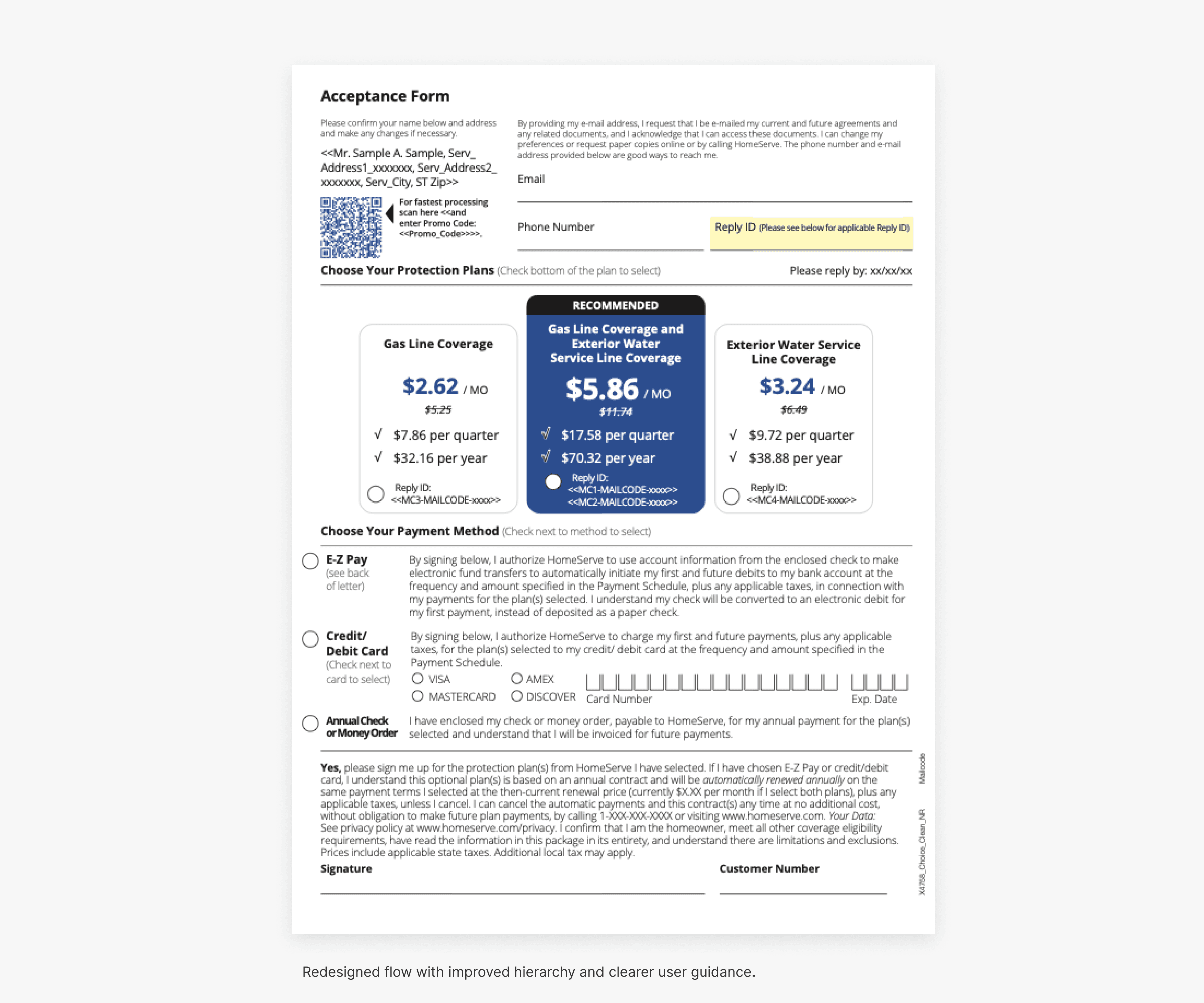
I redesigned the flow to improve clarity, usability and overall user guidance while maintaining brand consistency.
- Reworked layout structure to prioritize key conversion actions
- Simplified and restructured content for improved readability
- Applied a consistent typography and spacing system
- Introduced clearer visual cues to guide users step-to-step
- Delivered production-ready assets across all touch points
Collaboration
I partnered with marketing, product and compliance stakeholders to ensure the final design aligned with business goals, brand standards and regulatory requirements.
The Results
The optimized creative increased conversion rates by 23% compared to the control design, demonstrating the impact of improved visual hierarchy and messaging clarity.
Key Takeaways
- Small improvements in clarity can drive measurable business impact
- Strong hierarchy and content structure directly influence conversion
- Design systems and production consistency enable faster iteration